Websites That Feel Like Films: Design Systems That Convert Without Looking Templated
Cinema-grade brand sites that still convert: one fold job, motion that survives phones, and stacks that ship without looking like every other template site.
William Spurlock Founder — Spurlock Studios Updated 36 MIN
Most brand sites fail in one of two ways. They look expensive and convert like a mood board. Or they convert like a SaaS landing page and look like every other SaaS landing page. The work that pays is the third path: a site that feels authored — paced like a short film — and still has one clear job above the fold, proof that holds up under skepticism, and a path to contact that does not require a scavenger hunt.
That is the standard I build to at Spurlock Studios. This playbook is the full frame: composition, motion, performance, stack choice, CMS honesty, accessibility as craft, and the launch checklist that keeps go-live from becoming a week of DNS archaeology. The spoke posts under this pillar go deep on each system. This one is the spine.
The short answer
- One fold, one job. Brand, one headline, one support line, one CTA group, one dominant visual. Everything else is a later scene.
- Scroll is time. Sections are scenes. Cuts have intention. A long hold on a still can feel more expensive than five competing animations.
- Motion is a budget, not a personality. Prefer
transformandopacity. Never hide the title card behind JavaScript. Design the reduced-motion cut first. - Authored beats rented. Custom CSS on a generic card grid is still a template. A rebuilt builder site with real work and a locked type system can still feel like a film.
- Ship is production, not staging. DNS, forms, analytics, mid-range phones, and a rollback path. Pretty preview URLs do not book work.
What does “feels like a film” actually mean?
It does not mean a 40-second intro that blocks the homepage. It does not mean parallax on every section. It means the page has a deliberate sequence: establish the world, introduce the brand as a hero-level signal, state the offer, prove it, then ask for the next step. Cinema language maps onto marketing sites when you treat scroll as time and sections as scenes.
A film-grade site has:
- One composition in the first viewport. Not a dashboard of chips, stats, and promo stickers fighting the brand.
- Brand as the hero signal. If you remove the nav and the first screen could belong to another company, the branding is too weak.
- Atmosphere that supports the offer. Gradients and grain are fine as texture. They are not a substitute for showing the work, the place, or the product.
- Motion that earns its keep. Transitions that clarify hierarchy and presence — not noise that burns the Lighthouse budget.
- A conversion path that respects attention. One primary action. Secondary actions that do not compete for the same eye-line.
Templates fail this test because they optimize for “looks like a website.” Film-grade work optimizes for “this brand could only look like this.”
Think about how a trailer works. You get a world in seconds, a tone, a conflict, and a reason to care — then a clear invitation. A homepage is closer to a trailer than to a brochure. The mistake agencies make is stuffing the trailer with every subplot: every service, every award, every social proof chip, every seasonal promo. The audience leaves before the title card finishes.
When I say “film,” I mean pacing and authorship. Cuts have intention. Silence has intention. The sites that win awards and still book work tend to understand that restraint is a design decision, not a budget limitation.
Lindgaard and colleagues showed that people form a stable visual-appeal judgment of a webpage in as little as 50 milliseconds, and Nielsen Norman Group treats that snap call as the start of a halo effect on credibility. You do not get a second title card. The first viewport is the premiere.
Scene map: film beat to page job
| Film beat | Site scene | Job if it works | Failure if it does not |
|---|---|---|---|
| Establish world | Atmosphere, still, crop | “This could only be them” | Stock handshake, generic gradient |
| Title card | Wordmark + headline | Name and offer in one breath | Clever line nobody can repeat |
| Inciting incident | Offer / constraint | Why act in the next 90 days | Kitchen-sink service list |
| Evidence | Work, receipts, process | Skeptic accepts in ten seconds | Adjective pile, no names |
| Ask | Primary CTA | One next step, especially on mobile | Four buttons, equal weight |
| Credits | About / contact / CMS | Who is accountable; how to start | Orphan pages, dead form |
If a section does not map to a beat, it is filler dialogue. Cut it.
Continuity is the expensive feeling
Films feel expensive when the same production made every shot: the same grade, the same crop philosophy, the same sound. Brand sites feel expensive the same way.
- Type: two families max. Display for the title card, body for dialogue.
- Crop: faces and products share a ratio language. Random aspect soup reads as a clip reel from five editors.
- Motion: one easing family, one entrance grammar. Five libraries is five soundtracks.
- Color: one accent that means action. If every surface is “accent,” nothing is a cue.
- Media: real work, real rooms, real merch. Generated atmosphere is texture, not the plot.
A visitor should be able to screenshot any interior page, cover the logo, and still know the brand. That is continuity. That is the opposite of a theme.
How do you build a high-converting brand site?
Start with the job of the fold, not the mood board. Before type, color, or motion, answer four questions in writing:
- Who is this for in the next ninety days?
- What is the single action that makes the site worth the money?
- What proof would a skeptical visitor accept in under ten seconds?
- What must the brand feel like so the action feels consistent with the identity?
Then build the first viewport as one composition: brand, one headline, one supporting sentence, one CTA group, one dominant visual. That is the whole budget for the fold. Stats strips, schedule widgets, address blocks, and floating badges belong later — or nowhere.
Conversion on brand sites is not “more CTAs.” It is reducing the distance between recognition and action. Recognition comes from craft and specificity. Action comes from clarity and low friction (especially on mobile: tap-to-call for trades, clear booking for artists, a short form for studio work).
Pretty traffic with no next step is a different failure. If the site already gets visits and still starves the calendar, read Traffic But No Leads before you commission another motion pass.
A practical build order that survives client revision cycles:
| Phase | Deliverable | Failure mode if skipped |
|---|---|---|
| Brief | Job of fold, audience, proof assets | Design becomes taste negotiation |
| Structure | Page map with one job per section | Kitchen-sink homepage |
| Visual system | Type, color, spacing, media rules | Template drift across pages |
| Fold prototype | Static first viewport that converts | Motion hides a weak offer |
| Motion pass | Budgeted GSAP / Framer / CSS | Jank on mid-range phones |
| Content + CMS | Editable fields clients will use | Orphan pages nobody updates |
| Perf + a11y | Lighthouse and keyboard pass | Pretty site that fails real users |
| Launch | DNS, analytics, redirects, QA | Soft launch that never hardens |
The brief that prevents redesign hell
Most “we need another round” cycles are not taste problems. They are brief problems. If the client never agreed that the homepage exists to book discovery calls from mid-market brand leads — and not to please every stakeholder’s favorite service line — then every revision is a power struggle dressed as feedback.
Write the brief in sentences a non-designer can argue with.
- Primary action named in one verb (book, call, listen, request)
- Secondary action named, and ranked below the primary
- Out of scope for v1 written down (blog, careers, multilingual, shop)
- Proof assets listed: who, what shipped, what constraint
- Audience for the next 90 days, not “everyone who might someday”
That one paragraph saves weeks.
Information architecture before pixels
Map pages as jobs:
- Home: orient + convert
- Work / selected projects: prove taste and outcomes
- Offer / services: clarify scope and fit
- About: establish who is accountable
- Contact: remove friction
- Optional: journal/blog for authority, not vanity
If a page does not have a job, kill it. Orphan pages dilute crawl focus and dilute the brand story. For AI visibility and classic SEO alike, thin pages are liabilities.
A conversion path you can walk on a phone
Do this with the mouse unplugged and one thumb:
- Land on the homepage.
- Say the offer out loud from the first screen.
- Complete the primary action in as few taps as the offer allows.
- Confirm the success state (calendar, thank-you, tap-to-call, listen).
- Note every extra field, extra tap, and extra decision.
If step 2 fails, you have a fold problem. If step 3 fails, you have a path problem. If step 4 fails, you have a launch problem. Do not buy more cinema until you know which one you have.
What belongs in the first viewport?
Brand, one headline, one short supporting sentence, one CTA group, one dominant image or visual plane. Not stats, schedules, promo stickers, or secondary marketing modules. If the fold has two jobs, it has none. The composition checklist is above the fold that works.
The first viewport is the title card plus the opening shot. You are not designing a dashboard. You are designing the first three seconds of a trailer.
| Allowed on the fold | Park it below | Kill it |
|---|---|---|
| Wordmark | Award chips | Autoplay hero video as the only LCP |
| One headline a stranger can repeat | Full service grid | Four peer CTAs |
| One support line | Long about copy | Stock handshake |
| One primary CTA, one quiet secondary | Testimonials carousel | Chat widget covering the ask |
| One visual that could only be this brand | Blog teaser | Countdown clocks for nothing |
Fold inventory before you open the design tool
- Can a cold viewer name the offer after five seconds?
- Does the visual survive without the logo?
- Is the primary CTA the loudest object after the brand?
- Does the headline work as plain text, with motion off?
- Is the LCP node an image or text you control — not a third-party embed?
- On a 390px-wide phone, is the CTA still on the first screen?
If three of those fail, stop picking typefaces. Fix the composition.
Five-second title card test
Show the first viewport to five people who do not work on the brand. Hide it after five seconds. Ask only three questions:
- What do they sell?
- Who is it for?
- What should you do next?
If answers diverge, you have a strategy problem — fixable on a template or a custom build. If answers are right and they still say it feels cheap next to a peer, you have a craft problem. If they remember a texture and not an offer, you built a mood board.
Write their answers down. Do not argue with them in the room. The title card either reads or it does not.
Why “above the fold” still matters on infinite scroll
People scroll. They also bounce. The fold is not a legal boundary. It is the only frame you are guaranteed. Everything below is earned. Treat the first screen as if the rest of the reel might never play. That is how trailers are cut. That is how homepages should be cut.
How should motion work on a marketing website?
Motion is where brand sites either become memorable or become lawsuits against Core Web Vitals. The rule that keeps me honest: only transform and opacity are cheap. web.dev’s compositor guidance is blunt: those two properties can stay on the compositor; almost everything else is a negotiation with layout and paint. Their animation performance note says the same thing in operational language — if an idea cannot live in those two properties, change the idea, not the phone.
Production motion means:
- Hero content is visible before JS arrives. Never gate the headline on a timeline completing.
- ScrollTriggers and pinned scenes are cleaned up on unmount. Memory leaks are not “edge cases” on SPA-ish stacks. Official GSAP ScrollTrigger docs exist so you can pin, scrub, and kill on purpose — not leave orphaned
onUpdatecallbacks after a route change. prefers-reduced-motionis a first-class variant, not a degraded afterthought. MDN and web.dev both treat it as a user preference you query, not a nice-to-have.- Image and font budgets come before animation budgets. A beautiful tween on a 4MB hero is still a slow site.
- Motion has a job: entrance hierarchy, scene change, state feedback. Decorative loops that run forever are usually the first cut.
The production version of this budget is motion that survives production.
A motion budget you can defend
Treat motion like a production budget with line items:
| Line item | Allowance | Notes |
|---|---|---|
| Hero entrance | 1 short timeline | Must not block LCP text |
| Section reveals | Subtle, shared easing | Prefer CSS when enough |
| Scroll-scrubbed scene | 0–1 per homepage | Expensive; earn it |
| Page transitions | Optional | Only if routing model supports cleanup |
| Micro-interactions | Buttons, nav, forms | Always; these teach affordance |
| Ambient loops | Rare | Cut first under perf pressure |
Framer is excellent when the motion system is component-native and the team lives in design tools — their effects ride Motion, and reduced-motion settings can limit parallax, transform, and layout animation when the visitor asked for less. Custom GSAP on Astro or a similar static shell wins when you need total control and Lighthouse headroom. Webflow Interactions with GSAP cover a large middle of marketing motion without a dedicated engineer — until you need scrubbed timelines that survive production phones, plus honest teardown.
Deeper treatment: Motion Systems That Ship. Performance without sacrificing craft: Lighthouse 90+ Without Killing the Design.
Reduced motion is part of the design system
If the only reduced-motion path is animation: none !important, you will ship broken layouts where elements were left at opacity: 0. Author the static end-state first. Motion is a progressive enhancement on top of a complete site. That posture also makes QA saner: the no-motion build is always testable.
WCAG 2.2 Success Criterion 2.3.3 (Animation from Interactions, Level AAA) is the film-site criterion people skip: motion triggered by scroll, hover, or click must be disableable unless it is essential. Parallax is the canonical example — the user asked to scroll; the drifting background is an added effect. Technique C39 is the practical implementation: query prefers-reduced-motion and suppress the extra motion.
| Motion type | Full-motion cut | Reduced-motion cut |
|---|---|---|
| Hero entrance | Short opacity + translate | Instant end-state, no translate |
| Section reveal | Shared ease-in | Static, already visible |
| Scroll-scrub scene | One earned pin | Still frames, no pin |
| Page transition | Optional fade | Instant route, no wipe |
| Button / form | Opacity / scale micro | Color / underline only |
| Ambient loop | Rare, kill first | Never |
Framer’s own help is explicit: when reduced motion is on, effects often collapse to opacity. Design that collapse. Do not discover it in a client review on an iPhone with Reduce Motion enabled.
The failure mode I see on “cinematic” launches
A 12-second pinned hero. Headline starts at opacity: 0. LCP waits on a JS bundle, a webfont, and a 4K still that was lazy-loaded because “all images are lazy.” Mid-range Android paints a blank card. Desktop Lighthouse still looks fine because the lab machine is this year’s flagship.
That is not cinema. That is a title card that missed the premiere. Fix:
- Static HTML for the fold.
- Hero image discoverable in the markup, not a CSS background discovered late.
fetchpriority="high"on the LCP image — MDN and web.dev’s Fetch Priority guide both exist because browsers otherwise start in-viewport images at a low priority and promote them late.- Motion as enhancement after paint.
- Kill the pin if it cannot survive a mid-tier phone.
Custom website vs template — which one looks authored?
“Custom vs template” is the wrong binary. The useful split is authored system vs rented look.
A template can ship fast and still convert if you rewrite the information architecture, replace the stock imagery with real work, kill the multi-CTA hero, and constrain the type system so it cannot drift into generic SaaS. Most template failures are content and composition failures wearing a ThemeForest skin.
A custom build can still look templated if every section is a rounded card grid with icon rows and pill clusters. Custom CSS is not a brand.
Choose the stack by constraint, not by fashion:
| Constraint | Lean toward |
|---|---|
| Designer-led iteration, heavy motion, marketing pages | Framer |
| Client CMS edits, marketing collections, agency handoff | Webflow |
| Extreme performance, unique interaction model, long life | Custom (Astro / Next / similar) |
| Local trades, speed to phone call, low editorial volume | Tight Webflow or lightweight custom |
| Artist identity that must not look like a linktree skin | Custom or heavily rebuilt Framer |
Worth-it is a threshold test, not a personality test. When a Custom Website Is Worth It is the decision spoke. Cost anatomy without a rate card: Why Custom Sites Cost Five Figures. Tool comparison: Framer vs Webflow vs Custom.
Total cost of ownership, not sticker price
The cheap template that needs a developer for every copy change is not cheap. The custom app that nobody on the client team can update is not an asset. Ask:
- Who edits weekly content?
- Who owns hosting credentials in twelve months?
- What breaks when a campaign needs a landing page next Tuesday?
- Can the site survive a designer handoff without a rewrite?
Those answers matter more than whether the homepage uses WebGL. If you cannot leave cleanly, you do not own the site — If You Can’t Leave Cleanly, You Don’t Own the Site.
Three levels people confuse when they say “custom”
| Level | What it is | What you are actually buying |
|---|---|---|
| Theme setup | Swap colors and fonts on a template | Speed. Also sameness. |
| Custom CSS / tweaks | Overrides on a builder | Nicer skin. Still platform-shaped. |
| Authored brand system | Compositions, type, motion, CMS rules as one production | The film-grade bar |
Paying five figures for level two is how buyers get burned. If you want this pillar’s bar, you are buying level three — on Framer, Webflow, or a custom shell. The tool is secondary. The authorship is the product.
Framer, Webflow, or custom — how do you choose the stack?
Pick the constraint that will still be true in twelve months. Fashion expires. Editors, motion, and exit paths do not.
| If this is true | Choose | Because |
|---|---|---|
| Designers iterate daily; marketing pages are the product | Framer | Component-native effects, Motion under the hood |
| Non-developers must edit collections weekly | Webflow | CMS + GSAP interactions on the canvas |
| You need HTML-first folds and tiny JS | Custom / Astro islands | Static shell, hydrate only what must move |
| You need a unique interaction model (not a template of effects) | Custom + GSAP | Full control, full responsibility |
| You need a clean exit and portable content | Custom, or Webflow with an export plan | Ownership is a feature |
Astro’s islands architecture is the custom-stack reason I keep coming back to on brand sites: the page is static HTML; JS is an island you opt into. A marketing homepage should not hydrate like a SaaS app.
Decision checklist
- Who opens the CMS next Tuesday — designer, manager, or nobody?
- Is the hero a still, a short timeline, or a scrubbed scene?
- Do you need collections (tour, projects, locations) or a handful of locked pages?
- What is the exit story if the vendor relationship ends?
- Can the fold ship as HTML without waiting on a client bundle?
Three checks toward Framer. Three toward Webflow. Three toward custom. Ties go to the editor, not the demo.
What I will not do for “cinematic”
I will not pick a stack because a reel looked good on desktop. I will not hide the offer behind a WebGL prelude. I will not put the CMS in a tool the client will never open. Hundreds of production sites later, the pattern is boring and true: the stack that ships and stays editable beats the stack that wins a screenshot.
What design system does a film-grade marketing site need?
Product design systems optimize for infinite UI states. Marketing sites optimize for a finite set of scenes that must stay on-brand for years. You need tokens and components — you do not need a full Material clone.
Minimum viable marketing system:
- Type ramp with two families max (display + body), locked sizes for H1–H3, body, mono labels.
- Color tokens with one accent that means action, not decoration on every surface.
- Spacing scale that prevents “designer eyeballing” drift between pages.
- Media rules: aspect ratios, crop philosophy, when photography vs generated atmosphere is allowed.
- CTA variants with one primary and one quiet secondary — not five button styles.
- Section recipes: hero, proof, work grid, offer, FAQ, contact — each with a single job.
Tokens that survive client edits
Document the tokens in the same place the CMS lives when possible. A Figma file nobody opens after launch is not a system. A short “do / do not” page in Notion with hex values, type sizes, and example screenshots will outlive a 200-component library that was never finished.
Guardrails beat optionality. If editors can pick from twelve button styles, they will pick the wrong one under deadline pressure. Give them one primary and one text link style for body CTAs. Expand later only when a real page needs it.
| Token | Lock it | Let editors change |
|---|---|---|
| Display / body families | Yes | Headline and body copy |
| H1–H3 sizes | Yes | None |
| Primary CTA style | Yes | CTA label and href |
| Accent meaning “action” | Yes | None |
| Project image crop | Yes (ratio) | The photo itself |
| Section order on home | Usually | Almost never in v1 |
Section recipes, not page builders
A page builder that can become anything will become everything. Film productions do not invent a new aspect ratio per scene. Give the site six recipes and make new pages from those recipes.
- Hero (title card)
- Proof (receipts, not adjectives)
- Work grid (selected, not infinite)
- Offer (scope and fit)
- FAQ (objections)
- Contact (friction removed)
If a stakeholder wants a seventh recipe, they need a job for it. “It would be cool” is not a job.
How do you show proof without racing to the bottom?
Brand buyers do not trust adjectives. They trust specificity: who you worked with, what changed, what the constraint was, what shipped. Case study pages should sell the next project, not archive the last one. Structure: context → constraint → approach → result → what it means for a prospect like the reader → CTA.
Pricing pages for studios fail when they either hide the number until a sales call forever, or publish a race-to-the-bottom menu that trains buyers to shop SKUs. Clarity beats both: packages with scope boundaries, what changes the price, and a path for custom work.
Receipts over adjectives
On Spurlock Studios properties I cite receipts when claims need backing: hundreds of production websites shipped, 20,000+ hours architecting agentic systems, 35,000+ hours saved for clients across automations, and collaborations that are real. Your brand site should do the same in its own language. “Premium” means nothing. “Shipped artist sites with listen-first folds and tour blocks that update from a CMS” means something.
I will not invent conversion lifts for AllCity HVAC, Foxtide, Arkayla, Matt Coffey, or anyone else in the reel. Portfolio names prove what kinds of sites get built. They are not a license to fabricate percentages.
| Proof type | Use it when | Do not use it when |
|---|---|---|
| Named project + constraint | You can describe the hard part | You only have a pretty still |
| Process steps | Buyers fear a black box | You are hiding a missing offer |
| Scope / package boundaries | Serious buyers need to self-qualify | You are racing a $499 theme shop |
| Quotes | The quote names a specific outcome | It only says “great to work with” |
| Metrics | You measured them and can source them | A deck asked for “impact” |
Case study spine
- Who and what context.
- The constraint that made the work hard (time, identity, performance, CMS, mobile).
- The approach — fold job, motion budget, stack, what you refused.
- What shipped. Screens and a walkable path, not a mood.
- What a prospect like the reader should do next.
Pretty screenshots without stakes are a gallery. End every case study with a clear next step to contact.
Do music, trades, and premium brands convert the same way?
The craft standard is shared. The conversion mechanics are not. Same production values. Different asks.
| Lane | First-viewport job | Primary action | Proof that lands | Death state |
|---|---|---|---|---|
| Artists / musicians | Identity, then listen | Play, tour, contact, buy | Real stills, real dates, real press | Linktree skin or mute gallery |
| Trades / local SMB | Trust + phone | Tap-to-call, book, quote | Reviews, service area, real trucks | Brochure that hides the number |
| Premium brands / studios | Offer + authorship | Book a sprint / inquiry | Named work, process, pricing posture | Mood board with no path |
Artists and musicians need identity first, then paths to listen / tour / contact / buy. A site that looks like a streaming dashboard kills the brand. A site that is only aesthetic with no path to the next fan action kills the career ops. The film-led artist sites in the portfolio — Arkayla, Roe Kapara, Friday Pilots Club, Matt Coffey, and similar builds — are systems, not theme demos.
Trades and local SMBs need speed, trust, and the phone call. Service area, reviews, emergency vs scheduled CTAs, and pages that load on a job-site phone. Cinema here is restraint and clarity, not grain overlays on a hero that takes four seconds to paint.
Premium brands and studios need the film-grade composition plus commercial clarity: offer, proof, process, pricing posture, contact. This pillar is written primarily for that buyer and for the operators who serve them.
Shared anti-patterns across audiences
These show up everywhere:
- Hero with four competing CTAs
- Stock photography of handshakes and laptops
- Icon rows that restate the headline with clip art
- Infinite scroll galleries with no narrative
- Forms that ask for a novel before a conversation
- Nav that lists every service as a peer of the brand
- Autoplay video as the only above-the-fold content
- Chat bubbles covering the primary ask on mobile
Kill them early. They are the visual equivalent of filler dialogue.
One homepage, one audience this quarter
If you serve two audiences (fans and bookers, homeowners and commercial, buyers and wholesale), pick a primary for the homepage and give the other a dedicated path. A trailer that tries to sell two movies sells neither. The second audience gets a scene, not half the title card.
Why does performance decide whether cinema feels cheap?
Slow sites feel cheap, even when the art direction is expensive. Film grain on a 3-second LCP is not cinema; it is lag. The performance work is not a separate “tech phase” after the beautiful comps are approved. It is present in art direction choices: image weight, font count, how many client-side islands hydrate on load, whether video is a background or a click-to-play.
Google’s Core Web Vitals are the scoreboard I use in production, not as a religion, as a shared language. Search Central states the trio and the “good” bars: LCP at 2.5 seconds or less, INP at 200 milliseconds or less, CLS at 0.1 or less — each at the 75th percentile, mobile and desktop split. Optimize LCP is the breakdown I actually use on brand heroes: TTFB, resource load delay, load duration, render delay.
| Vital | “Good” bar (Google) | What usually breaks it on film-grade sites |
|---|---|---|
| LCP | ≤ 2.5s | Lazy hero, CSS-background LCP, webfont + JS gate |
| INP | ≤ 200ms | Chat, analytics, motion libraries on the main thread |
| CLS | ≤ 0.1 | Font swap explosions, embeds, sticky bars after paint |
Image and font defaults I actually ship
- Modern formats (AVIF / WebP) with sane dimensions per breakpoint. MDN’s LCP image note is the same advice in shorter form: format, priority, do not lazy-load the hero.
- Hero: eager,
fetchpriority="high", discoverable in HTML. Everything below the fold can wait. - Preconnect for font origins.
font-display: swapfor the faces that carry the offer;optionalfor decorative display faces you can live without on a slow network. - Static HTML for the fold whenever the stack allows.
- Hydrate interactive islands on visibility or interaction — Astro’s model if you are on a custom shell.
- Measure on a mid-tier Android on a throttled network, not only on a desktop Lighthouse run.
What to cut first when the premiere stutters
- Ambient background video
- Extra webfont weights
- Chat widgets on first load
- Forever loops and extra pinned scenes
- Third-party embeds above the fold
- The second scroll-scrubbed set piece
Art direction stays. The extras go. That is how you keep cinema and still pass real phones. Tactics live in Lighthouse 90+ Without Killing the Design.
Video is a scene, not a background
Autoplay hero video is the fastest way to make a film-grade comp feel cheap on a phone. It steals the LCP slot, fights INP once the decoder wakes up, and often has no pause control — which is a WCAG 2.2.2 Pause, Stop, Hide problem as well as a taste problem.
| Hero media | Use it when | Default |
|---|---|---|
| Still (AVIF/WebP) | Almost always | Yes |
| Short muted loop, click-to-play | The motion is the product | Poster first, play on tap |
| Full autoplay background | Almost never on marketing homes | Still + optional play |
If the brand insists on motion in the opening shot, shoot a still that could carry the title card alone. The loop is a bonus reel, not the premiere.
Is accessibility compatible with cinematic craft?
Yes — if you design the accessible states on purpose. Accessibility is not a checklist you run the night before launch. It is whether the reduced-motion variant was designed, whether focus states exist, whether contrast holds on the actual photography, whether the form can be completed with a keyboard, whether the phone number is a real link. Treat it as craft and the compliance story gets easier because the experience is already usable.
WCAG 2.2 Contrast (Minimum) is the one cinematic sites fail on photography: 4.5:1 for normal text, 3:1 for large text. White type on a pale still is not “editorial.” It is unreadable. A scrim is part of the grade, not a compromise.
| Craft item | Film-site version | Fail state |
|---|---|---|
| Contrast | Scrim or type color that holds on the real still | Overlay text that only works in Figma |
| Focus | Visible ring that matches the system | Custom cursor, no focus |
| Keyboard | Full path to contact | Trap in a modal or canvas |
| Motion | Designed reduced cut | opacity: 0 leftovers |
| Labels | Visible text matches the accessible name | Icon-only controls |
| Video | Click-to-play, captions if it carries meaning | Autoplay with no pause |
The keyboard tour
Before you call a site done, tab through the homepage and contact path with the mouse unplugged.
- Focus is visible on every interactive control
- Order matches the visual story
- No custom cursor experiment steals focus
- Modals close with Escape and return focus
- Skip link works
- Form errors are announced, not only colored
Fancy pointers are optional. Focus is not. A film that cannot be watched with the lights of the interface on is unfinished.
What happens after launch if nobody can edit the site?
A site that cannot be updated dies. Decide the editorial rhythm before you pick the CMS:
- Who publishes tour dates, case studies, or seasonal offers?
- How often?
- What is the approval path?
- What is allowed to change without a designer?
Then build the CMS around that rhythm. A Webflow collection for projects with locked fields beats a headless CMS with twenty models nobody fills. A Markdown content folder in the repo beats a “flexible” page builder if the only editor is the developer.
| Rhythm | CMS shape | Do not do |
|---|---|---|
| Rare copy tweaks | Locked pages, a few fields | Full page builder |
| Weekly projects / dates | One collection, required fields | Freeform modules per item |
| Campaign landing pages | A recipe + duplicate | New design system per campaign |
| Developer is the editor | Markdown / repo | Fake “client CMS” nobody opens |
Guardrails that keep the grade intact
Limit editable surfaces. Give them fields for copy, images, and posts — not freeform layout. Train with a one-page editing guide. Choose a CMS they will actually open; unused CMS is dead weight.
- Primary and secondary CTA styles only
- Image fields enforce ratio or reject the upload
- No “add any section” on the homepage
- Alt text is a required field, not a later chore
- Preview exists; publish is a named person
If the brand can be broken in one afternoon of “just updating the hero,” you did not ship a system. You shipped a costume.
What does a real launch look like for a brand site?
A beautiful staging site that dies in DNS, analytics, or redirect hell is not shipped. Launch means production URL, HTTPS, canonicals, sitemap, robots, form deliveries tested, analytics firing, 404 that matches the brand, and a rollback path.
Soft launch vs hard launch
I often soft-launch to a small list first: check forms, analytics, mobile render, and the primary conversion path. Hard launch is DNS cutover plus announcement. Mixing those without a checklist is how you announce a site whose contact form posts to /dev/null.
| Check | Soft launch | Hard launch |
|---|---|---|
| Forms deliver to a human inbox | Required | Re-test after DNS |
| Primary CTA on a real phone | Required | Required |
| Analytics / conversion events | Required | Confirm production IDs |
| HTTPS + canonical | Staging OK | Production host |
| Redirects from the old IA | Draft map | Live map + monitor |
| Open Graph still | Required | Required |
| 404 matches the brand | Nice | Required |
| Rollback (previous deploy / DNS TTL) | Named | Named |
Launch checklist I will not skip
- Production URL resolves; HTTPS is real, not “it’s fine on Netlify preview”
- Redirect map for every URL that had equity
- Canonicals, sitemap, robots agree with each other
- Form test from a phone on cellular, not only office Wi-Fi
- Analytics events for the primary action
- Open Graph image is the title card, not a random crop
- 404 is on-brand and offers a way home
- LCP / INP / CLS checked on a mid-range Android
- Reduced-motion pass
- Keyboard pass
- Who owns domain, hosting, and Search Console is written down
Staging beauty is not launch. If you cannot name the owner of the domain in twelve months, fix that before you announce — see the ownership spoke again.
When is a website sprint enough versus a full rebuild?
Not every brand needs a greenfield rebuild. Sometimes the domain, SEO equity, and CMS content are fine — the fold, motion, and proof are not. A website sprint is the right tool when you can name the failure: weak first viewport, no mobile path to contact, motion that tanks performance, pricing that confuses, case studies that do not sell. A full rebuild is the right tool when the IA is wrong, the stack cannot meet the motion or performance bar, or the brand system was never authored in the first place.
Be honest about which problem you have. Spending a rebuild budget on a fold problem wastes money. Spending a sprint budget on a rotten information architecture wastes time.
| Signal | Sprint | Rebuild |
|---|---|---|
| Fold is the leak | Yes | No |
| Motion / LCP is the leak | Yes | Only if the stack cannot host a budget |
| Proof pages do not sell | Yes | No |
| IA is a junk drawer | No | Yes |
| Theme owns every composition | Maybe a heavy sprint | Often a rebuild |
| You cannot leave the platform cleanly | Scope ownership first | Then rebuild on something you own |
| Content model is twenty unused types | Trim in a sprint if the IA is sound | Rebuild if the model is the product |
Buy the smallest scope that removes the template cap. Do not buy a museum renovation when you needed a storefront.
Worked splits I actually use:
- Artist on a tired builder, strong identity assets. Sprint: authored home, listen/tour/contact paths, CMS for dates. Rebuild only if the platform cannot host the motion or the exit is locked.
- Trade company with healthy Google reviews and a brochure site. Sprint: phone-first fold, service-area proof, tap-to-call. Rebuild if the IA is fifty thin pages with no jobs.
- Premium brand whose packaging already looks expensive. Sprint if the domain and content are sound and the leak is the fold. Rebuild if every page is a rented card grid and the CMS is a junk drawer.
If you are deciding now, start with /websites. If you already know you need the sprint, go to /contact?intent=websites-sprint.
What I will not call cinema
- A 40-second intro that blocks the homepage
- A headline that does not exist until JavaScript finishes
- Parallax on every section because the template offered it
- Grain and gradients with no offer
- Four CTAs of equal weight
- A custom cursor that hides focus
- A form that was never tested on cellular
- A “premium” adjective where a named constraint should be
If those are on the cut, you do not have a film-grade site yet. You have a trailer with the wrong footage.
Cluster map
This essay is the hub. Open a spoke when you are implementing one surface, not when you want another metaphor.
Fold, motion, performance
- Above the fold that works
- Motion systems that ship
- Motion that survives production
- Lighthouse without killing the design
- Accessibility as craft
Stack and ownership
- When a custom website is worth it
- Why custom sites cost five figures
- Framer vs Webflow vs custom
- Hire a designer vs a DIY builder
- Who owns your website when you leave
- Design systems for marketing sites
Launch and conversion
- Traffic but no leads
- Conversions dropped after a redesign
- Launch checklists for brand sites
- How many pages a small business needs
FAQ
How do you build a high-converting brand site?
Write the job of the fold first: audience, single action, proof, brand feeling. Build one composition above the fold — brand, headline, support line, CTA, dominant visual — then add sections that each do one job. Conversion comes from recognition plus a short path to action, not from stacking more buttons.
What is motion design for marketing websites supposed to do?
Motion should clarify hierarchy and create presence: entrances, scene changes, state feedback. Prefer transform and opacity. Never hide critical content behind JavaScript. Respect prefers-reduced-motion. Cut forever-loops that do not teach the user anything.
Is a custom website better than a template?
Custom wins when you need a unique interaction model, extreme performance, or a long-lived system. A rebuilt template can win on speed and budget if the IA, imagery, and type are authored. A custom site that copies SaaS card grids is still a template in spirit.
Should I use Framer or Webflow for a brand site?
Use Framer when design-led motion and marketing pages are the center of gravity. Use Webflow when clients need to edit collections and marketing CMS fields without a developer. Go custom when neither tool’s constraints match the product you are shipping. Compare in detail in the Framer vs Webflow vs Custom spoke.
How important is Lighthouse for a cinematic site?
Important enough that “it looked fine on my MacBook” is not a launch criterion. Aim for strong Core Web Vitals on mid-range Android — LCP at 2.5s or under, INP at 200ms or under, CLS at 0.1 or under, at the 75th percentile. Image format, font loading, JS hydration, and motion budget decide whether film-grade craft survives contact with real networks.
What belongs above the fold?
Brand, one headline, one short supporting sentence, one CTA group, one dominant image or visual plane. Not stats, schedules, promo stickers, or secondary marketing modules. If the fold has two jobs, it has none.
CTA
If the site looks expensive and still converts like a mood board, stop adding scenes. Fix the title card, the motion budget, and the ask.
Explore /websites or book a Website sprint at /contact?intent=websites-sprint.
What questions does this article answer?
- How do you build a high-converting brand site?
- Write the job of the fold first: audience, single action, proof, brand feeling. Build one composition above the fold — brand, headline, support line, CTA, dominant visual — then add sections that each do one job. Conversion comes from recognition plus a short path to action, not from stacking more buttons.
- What is motion design for marketing websites supposed to do?
- Motion should clarify hierarchy and create presence: entrances, scene changes, state feedback. Prefer `transform` and `opacity`. Never hide critical content behind JavaScript. Respect `prefers-reduced-motion`. Cut forever-loops that do not teach the user anything.
- Is a custom website better than a template?
- Custom wins when you need a unique interaction model, extreme performance, or a long-lived system. A rebuilt template can win on speed and budget if the IA, imagery, and type are authored. A custom site that copies SaaS card grids is still a template in spirit.
- Should I use Framer or Webflow for a brand site?
- Use Framer when design-led motion and marketing pages are the center of gravity. Use Webflow when clients need to edit collections and marketing CMS fields without a developer. Go custom when neither tool's constraints match the product you are shipping. Compare in detail in the Framer vs Webflow vs Custom spoke.
- How important is Lighthouse for a cinematic site?
- Important enough that "it looked fine on my MacBook" is not a launch criterion. Aim for strong Core Web Vitals on mid-range Android — LCP at 2.5s or under, INP at 200ms or under, CLS at 0.1 or under, at the 75th percentile. Image format, font loading, JS hydration, and motion budget decide whether film-grade craft survives contact with real networks.
- What belongs above the fold?
- Brand, one headline, one short supporting sentence, one CTA group, one dominant image or visual plane. Not stats, schedules, promo stickers, or secondary marketing modules. If the fold has two jobs, it has none.
Last reviewed
Keep reading.
 Websites
 What does website maintenance cost and include after launch
After launch, maintenance is hosting, deps, CMS, edits, uptime, backups — not new features. Cost depends on stack; use labeled bands, not a fake monthly rate.
 Websites
 How many fields should a contact form have
Default to 3–5 fields that change the reply: name, email, intent, and one qualifier. Extra questions belong on a second step after they start — not first.
 Websites
 When should a small business redesign their website
Redesign when conversion collapses, mobile fails, the CMS locks, the offer changed, or trust went stale — not because the site turned three years old.
Websites
 Websites
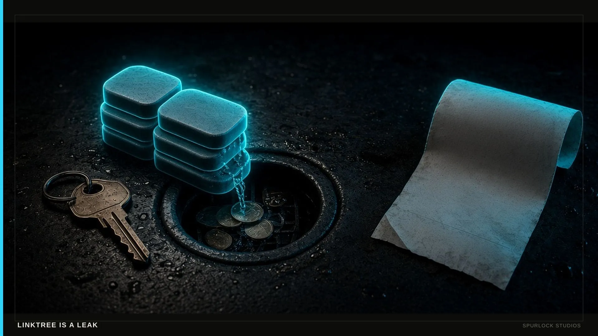
 Linktree is a leak — build the house
Spotify does not send you the fan’s email. Instagram rents the following. Linktree is a hallway with no register. The House is the owned room: site, membership, checkout, follow-up.
 Websites
 The shop site that answers the phone
A Midwest shop does not lose the job to a prettier hero. It loses the job to whoever looks real and picks up. Here is what the site has to do on a Saturday.
 Websites
 A media kit the brand can steal in sixty seconds
Influencers need a brand-safe /media or /kit with rates and demographics you can stand behind — not a Google Doc with dead links. This is not a booker EPK.
 Websites
 Creator Site or Business Site for the house?
Creator Site ($3,500) is tour, listen, join, buy. Business Site ($8,000) is the register. Pick after the $1,500 sprint — not before you have seen the house.