Case Study Pages That Sell the Next Project
A case study sells the next project when it shows problem, decisions, honest proof, and a CTA for that class of work — not a gallery of pretty screenshots.
William Spurlock Founder — Spurlock Studios Updated 20 MIN
A portfolio that only looks expensive is a gallery. A case study page that sells the next project is a sales asset: it shows the problem you walked into, the decisions you made, the proof you can cite, and the action a buyer should take. Pretty screenshots without stakes convince other designers. Buyers need causality. This spoke sits under Websites That Feel Like Films.
The short answer
- Use one spine on every study: title card, context, problem, decisions, work media, honest outcomes, optional credits, CTA for the same class of work.
- Publish fewer, deeper pages. If you cannot name a real constraint, keep the project on the index.
- Cite only numbers and quotes you can defend on a call. Prefer ranges, qualitative proof, or no outcomes block over theater.
- Build the work index to filter by lane. Build the case study to close belief for one class of hard thing.
- Put one primary CTA after proof, with intent in the URL. Contact should win visually over “view more work.”
What does a case study page actually sell?
Studio conversion is not “add to cart.” It is “this team has done my kind of hard thing; I should talk to them.” Nielsen Norman Group’s B2B research treats that as a long, multi-criteria decision: early visitors want simple facts; later visitors want depth they can take into an internal conversation.
The page has one job. Homepage and lane pages tease proof. The case study closes belief for a specific class of project. Do not paste the full study onto the homepage. Do not leave the study orphaned without a path back to /websites.
| Page | Job | Failure if it tries to do more |
|---|---|---|
| Homepage | Recognition + one next step | Becomes a portfolio dump |
| Work index | Filter by lane and class | Becomes a tag cloud |
| Case study | Belief for one class of work | Becomes a mood board |
| Offer / sprint page | How to hire | Restates the gallery |
If a prospect can enjoy the page and still not know who should hire you next, you shipped a lookbook.
What is the best case study page structure?
I use a repeatable spine. Customize voice and visuals. Keep the spine honest. NN/g’s portfolio case-study process lands in the same place from the hiring-manager side: describe the work, the process that produced this interface, and the business impact you can actually support.
- Title card — Client or project name, one-line outcome or role, one dominant visual
- Context — Who they are, what market, why the work mattered now
- Problem — The constraint, failure, or ambition in concrete terms
- Approach — Decisions and why (not a tool dump)
- Work — Media that proves craft: folds, flows, motion stills, before/after when fair
- Outcomes — Metrics you can defend, quotes, qualitative results
- Credits / stack — Short, optional, true
- CTA — Invite the next project of the same class
If a section has nothing true to say, omit it. Empty “Results: engagement improved” is worse than no results block.
Title card rules
Brand of the client can be loud; your studio chrome should not smother it. One primary visual plane. One sentence that states the job (“Rebuilt the tour funnel for a touring artist” beats “A digital experience”). Link to the live site only when the live site still represents the work.
- One sentence a buyer can repeat
- One hero frame, not a collage of six devices
- Client mark present; studio chrome quiet
- Live URL only if production still matches the story
- Archival label + date if the live site has drifted
How do you write a case study problem without theater?
Write the problem as an operator would recognize it. Buyers smell invented crisis language.
| Weak problem | Operator-grade problem |
|---|---|
| “The brand needed to elevate its digital presence.” | “Managers could not update dates without a developer.” |
| “Users struggled to engage.” | “Homepage looked like a Linktree on a domain.” |
| “We unlocked growth.” | “Paid traffic landed on a fold with three competing CTAs.” |
| “The old site felt dated.” | “The quote form pooled every postcode into one inbox.” |
Read the problem aloud. If a practitioner in that industry does not nod, rewrite. Music and trades are different classes: a $uicideboy$ or The Wrecks study is about owned destination versus a link-in-bio leak; an AllCity HVAC or Matt Coffey Design study is about proof a buyer can evaluate before they call. Name the class. Do not invent a percentage to make the class sound larger.
Should a case study list decisions or tools?
List decisions, not software logos. “We cut the fold to one CTA and moved proof to scene two” is approach. “We used React, GSAP, and Cloudflare” is ingredients. Ingredients can live in a short stack line. They are not the story.
Decision list I actually write:
- What we refused to put on the first viewport
- What the primary action became, and why
- What we moved to scene two so the fold could do one job
- What the client can edit without a developer
- What we left out on purpose
A logo wall of tools is a junior portfolio habit. It tells a peer you know the stack. It does not tell a buyer you can choose.
What belongs in case study outcomes — and what does not?
Outcomes are the section most studios fake. That is also the section that dies first on a sales call.
| Allowed | Not allowed |
|---|---|
| A metric the client cleared, with time window and definition | “Engagement improved” with no baseline |
| A directional range the client will still stand behind | Fake precision to two decimal places |
| A named quote you can clear | “Marketing VP, Fortune 500” with no name |
| Qualitative change a buyer can inspect (fold, flow, CMS) | Stock photography posed as the shipped product |
| “We do not publish numbers on this one” | Invented lift to fill the template |
If you cannot defend it, cut it. Traffic without leads is usually intent or a broken path — the same honesty applies here. A case study that claims “more leads” without saying what was measured trains the prospect to distrust the rest of the page.
How do you make a portfolio website that converts?
The work index should filter fast by lane (websites, automation, music, trades) without becoming a tag cloud. Each card needs: name, one-line outcome or category, and media that reads at small size. Clicking through should feel like entering a scene, not downloading a PDF.
| Surface | Depth | Media | CTA |
|---|---|---|---|
| Index card | One line + category | Crop that reads at 400px | Enter the study |
| Case study | Constraint, decision, proof | Full-bleed work + optional loop | Hire for this class |
| Related rail | Same lane only | Still, not a second hero | Next study or contact |
Twelve thin case studies with stock phrasing lose to five deep ones with real constraints and media. If you cannot say something specific, keep the project on the index with a short caption and do not force a hollow case study URL.
Index checklist:
- Index filter works in two taps on a phone
- Card hook matches the study’s problem line
- Related rail stays inside the same lane
- Orphan studies have a path back to the lane page
- Retired work is archived, not left as current proof
Should every project get a case study?
Not every shipped site deserves /work/that-name. A URL is a promise that you can brief a buyer on the constraint. Use a gate, not a guilt trip about “showing everything.”
| Signal | Index card only | Full case study |
|---|---|---|
| You can name the operator problem in one sentence | Optional | Required |
| You have clearance on hero media | Card crop | Full-bleed + gallery |
| You can describe at least two decisions | Caption | Approach section |
| Outcomes are cleared or honestly omitted | Fine | Fine either way |
| The offer is one you still sell | Keep | Publish |
| The live site contradicts the story | Hide or archive | Do not publish as current |
Pick the five by constraint class, not by which hero looks best in a grid. A touring-artist study, a trades proof study, and a product/editorial study cover more buying situations than five near-identical music posters.
Selection checklist:
- Each published study maps to a class you still want to sell
- No two studies tell the same story with different nouns
- At least one study matches the current inbound lane
- Retired offers are archived, not featured
- The index still shows volume; the study list stays short
How do you show before-and-after fairly on a case study?
Before/after is the fastest proof on a case study and the easiest to cheat. Fair comparison means the same job, the same viewport, and the same moment in the user path.
| Fair | Unfair |
|---|---|
| Old homepage fold vs new homepage fold, same breakpoint | Old mobile vs new desktop |
| Old date-update flow vs new CMS flow | A wireframe vs a finished brand film |
| Client’s previous live URL, captured before launch | A competitor’s site labeled as “before” |
| Same crop, same scroll position | Zoomed “after” that hides the clutter you left |
If you do not have a real before, say so. A process artifact (rejected fold, first wire) can show a decision without pretending it was production. Caption the pair: what changed, and what stayed. Buyers forgive missing befores. They do not forgive a stacked comparison that lies about the viewport.
Before/after checklist:
- Same breakpoint and same path step
- Caption states what changed
- “Before” is their prior production, not a competitor
- Missing before is labeled, not faked
- After crop does not hide leftover clutter
How do buyers actually scan a case study?
They do not read your novel. NN/g’s F-pattern research is still the default on walls of text: a couple of horizontal passes, then a vertical skim down the left. Layer-cake scanning is the useful alternative — people bounce across headings and only drop into the section that matches their constraint.
That is why the headings on a case study should be question-shaped and specific: “What was broken,” “What we decided,” “What you can see,” “What we can prove.” Front-load the information-carrying words. “Process” and “Overview” waste the left-edge skim.
| Heading that dies in a skim | Heading that survives a skim |
|---|---|
| Overview | What the site had to do |
| Our process | Decisions we made on the fold |
| The solution | What changed in the first viewport |
| Results | What we can prove (and what we cannot) |
| Next steps | Hire us for this class of project |
Give buyers jump anchors. Problem, Approach, Outcomes. If they only read those three heads and the title card, they should still know the class of work.
B2B buyers also need ammunition for someone who is not in the room. NN/g on convincing decision makers is blunt: your advocate has to survive a screening pass and then argue internally. A case study that is only vibes cannot be forwarded. A case study with a clear problem, a decision list, and one honest proof block can.
How do you prove craft on a case study without killing LCP?
Case studies die when every figure is a tiny UI shot on a fake plastic device. Prefer real folds. Pair that with the photography rule in real photos versus stock: proof pages are where stock photography starts lying.
Prefer:
- Full-bleed crops of the real fold
- Short muted loops of motion that matter, with a still for reduced-motion
- Pairings: old fold versus new fold when comparison is fair
- Process artifacts only when they clarify a decision
Do not:
- Autoplay sound
- Stack six device mockups as the hero
- Lazy-load the title-card image
- Ship a gallery of stock “team collaboration” as if it were the work
web.dev’s LCP guidance treats the largest above-the-fold image as the metric that usually decides first paint. Browser-level lazy loading is for images outside the first viewport — not the title card. Prioritize the hero. Lazy-load the gallery. Compress. A case study that takes eight seconds to show the work is an irony.
Motion has rules, not vibes. WCAG 2.2.2 Pause, Stop, Hide wants a pause, stop, or hide control for auto-starting movement that lasts more than five seconds beside other content. WCAG 2.3.3 and technique C39 want prefers-reduced-motion honored so vestibular-triggering motion can be suppressed. Pair a muted loop with a still. Do not autoplay four videos.
Media checklist:
- Title-card image is discoverable in HTML, not a late CSS background
- Title-card image is not
loading="lazy" - Below-fold gallery is lazy-loaded
- Loops are muted; sound is opt-in
- Reduced-motion users get a still
- Auto-playing motion over five seconds has a pause control
- Captions name what the frame proves
What if NDAs block case study metrics?
Only cite numbers you are allowed to cite. Prefer ranges, directional outcomes, or qualitative proof when NDAs block metrics. Named quotes beat anonymous titles. Fake precision destroys trust when a prospect asks for detail on a call.
The FTC Endorsement Guides are not “influencer law only.” An endorsement has to reflect the honest opinion of the endorser, and you cannot use a quote to make a claim you could not make yourself. If you paid for the quote, or the speaker works for you, that connection is material. If you cannot clear the quote, do not run it.
| Situation | What to publish | What to refuse |
|---|---|---|
| Client cleared a metric | Number + window + definition | The number without the window |
| NDA blocks numbers | Decisions + inspectable UI + qualitative | Invented lift |
| Quote cleared, named | Name, role, one sentence | “Fortune 500 VP” cosplay |
| Quote not cleared | Nothing | Paraphrase that still sounds like them |
| Live site drifted | Archival note, or update the study | A live link that contradicts the copy |
I have shipped hundreds of production sites. I still leave outcomes blank when the client cannot stand behind a number. Blank is honest. “2.7x engagement” you cannot define on a call is a liability.
Where should the CTA go on a case study page?
Primary CTA should match the offer: start a websites sprint, book a call, request a similar build. Secondary can link to related work in the same lane. Avoid equal-weight buttons for “View more work” and “Contact.” Contact should win visually at the end of a strong case study.
Pre-fill intent when you can (/contact?intent=websites-sprint) so the inbox carries context. Mention the case study class in the form helper text: “Tell us about a project like this.”
| Placement | Role | Visual weight |
|---|---|---|
| Nav | Quiet, always there | Low |
| After outcomes | Primary hire path | Highest |
| Related rail | Same-lane studies | Medium |
| Footer | Legal + repeat contact | Low |
| Mid-page newsletter | Optional, never primary | Lowest |
If they found you through a study and still cannot tell how to hire you, the CTA failed. Fix the page before you buy more traffic to it.
What CMS fields keep case studies honest?
Structure case studies as a CMS collection with required fields. Locked template. That keeps the portfolio coherent when someone adds projects after handoff.
Required:
- Title
- Excerpt / card hook
- Hero
- Problem
- Approach
- Gallery
- CTA label + intent URL
Optional:
- Outcomes (long text, not a forced metric field)
- Quote + attribution
- Stack / credits
- Live URL
- Archival date
Do not make “metric” required. Required metric fields are how hollow numbers get invented at 11 p.m. before a launch. Optional outcomes plus a publish checklist beats a template that demands a percentage.
Editor rules worth locking:
- Card hook must match the on-page problem line
- Live URL cannot publish if “archival” is checked
- Quote field requires a name field
- Hero alt text is required
- CTA intent is a select, not free text
How should case study titles name the problem class?
Case study URLs should use clear slugs and titles that name the problem class, not only the client codename. Opening paragraphs should answer what was done for whom. Google’s title-link guidance is automated: <title>, visible H1, and og:title all feed the same decision. Make them agree. Write a unique meta description that states problem and outcome. Do not stuff.
Article structured data can help Google understand headline, author, and date. schema.org CreativeWork is the broader type if the page is more project than article. Schema does not rescue a vague title. Content honesty still does more than markup.
| Asset | Rule |
|---|---|
| Slug | Problem class + client if the name is public (tour-site-the-wrecks, not project-12) |
| H1 | Same job as the title card sentence |
| Meta description | Problem + outcome, unique per study |
og:title / og:image | Match the visible title; show a recognizable frame (Open Graph) |
| Internal links | Pillar + same-lane spokes, not a dump of every post |
Internal links to the pillar and relevant spokes deepen the cluster without stuffing. This page belongs under Websites That Feel Like Films. Related spokes that already exist: photography ethics and lead-path diagnostics.
What anti-patterns turn a case study into a gallery?
- Gallery-only pages with no problem statement
- Tool logo walls as “approach”
- Metrics you cannot defend on a sales call
- Password gates with no context for prospects who need a peek
- Identical case study prose with nouns swapped
- CTA to nowhere (“Coming soon” at the end of a sales asset)
- Stock photos doing the selling on a proof page
- Equal-weight “see more work” and “contact” after a strong study
- Live links to a fold the client has since replaced
- Studies for offers you no longer sell
Password gates are a product decision, not a decoration. If a prospect needs a peek to hire you, give them a share policy: time-boxed link, watermarked stills, or a public cut that omits the confidential frames. A lock icon with no path is a dead end.
How does a dishonest case study train distrust?
The expensive failure is not “we forgot a case study.” It is a published study that a prospect later checks against reality.
What breaks:
- The live site no longer matches the praised fold
- The metric cannot be defined when they ask “over what period?”
- The quote is anonymous and they smell it
- The CTA points at an offer you retired
- The card hook promised a different story than the page
What it costs: the call starts in a hole. You spend the first ten minutes unwinding your own page instead of mapping their constraint.
What you do instead:
- Mark drifted work archival with a date, or update the frames
- Delete numbers you cannot stand behind
- Align the study with the current offer page
- Send one matching study, not a twenty-project tour
Bravery is not a restore strategy. If the page is wrong, take it down or date it.
How should you use case studies in sales?
Send the one case study that matches the prospect’s constraint class, not your favorite aesthetics. On calls, walk the problem and the decision, then open media. Do not screenshare twenty projects. One resonant proof beats a tour.
When a prospect mentions a specific study, do not restart the portfolio. Ask which constraint resonated, then map it to their situation in two minutes. Follow up with that study plus the matching offer CTA.
| Prospect class | Study class to send | Do not send |
|---|---|---|
| Touring artist / label | Owned destination, tour/merch path | A trades quote-form study |
| Trades / local service | Proof before the call, routing, schema | A festival scroll sequence |
| Product / editorial brand | Catalogue + journal, not a poster | A merch-only music page |
| Studio peer / referral | Decision list they can reuse | A mood board with no stakes |
For inbound, let analytics show which case studies assist contact events. Double down on lanes that create conversations. Retire or rewrite pages that attract the wrong work. Relevance beats volume.
How long should a case study be?
A strong case study is often 400–800 words of prose plus media — enough to brief a buyer, not a novel. If you need a long technical teardown, separate it from the sales case study. Buyers skim. Give them anchors.
Homepage and lane pages tease. Case studies close. The film model still applies: each page one job. The case study’s job is belief for a specific class of project.
Repurpose carefully. A LinkedIn post can pull constraint plus result. The page remains canonical. Do not fragment the story into conflicting versions across social and site.
Quarterly, prune studies that no longer represent the studio. Portfolios accumulate nostalgia. Buyers want evidence you solve today’s problems with today’s stack and taste. I have been SEO-certified since 2021 and I still kill pages that rank for work I no longer want.
What should you QA before a case study goes live?
Before publish:
- Clearance on every asset and quote
- Metrics include window and definition, or they are gone
- CTA hits the current intent URL
- Mobile screenshots match production
- Live project link still matches the story, or the study is archival
- Problem section sounds like the industry, not a slogan
- Closing CTA names who should hire you next
- Offer page and study promise the same engagement
- Unique meta description and a recognizable Open Graph frame
- Index card hook matches the page
- Reduced-motion still exists for every loop
- No autoplay sound
Print the page or view it on a phone. Ask whether a skeptical buyer would understand the stakes in under a minute. If not, tighten the outcome line and the problem statement. Then ship. Perfect is the enemy of published proof.
Also verify the live project link. A case study that praises a fold the client has since replaced trains distrust. When the live site drifts, update the study or mark the work as archival with a clear date.
FAQ
What is the best case study page structure?
Title card, context, problem, approach, work media, outcomes, short credits, and a CTA aimed at the next similar project. Skip any section you cannot support with truth. Empty results copy is worse than omitting the block.
How do I make a portfolio website that converts?
Filter work by lane on the index, deepen a few specific case studies, cite only honest proof, and end with a contact path that carries intent. Volume without stakes is a gallery. Conversion here means “they should talk to us about this class of work.”
How long should a case study be?
Long enough to show constraint, decision, and proof — often a few hundred words plus media. If you need a technical essay, split it from the sales page. Buyers skim headings first; those headings should still carry the argument.
What if NDAs block metrics?
Use qualitative outcomes, permitted ranges, process decisions, and quotes you can clear. Do not invent numbers. A named decision the buyer can see in the UI is stronger than a fake percentage.
Should every project get a case study?
No. Only projects where you can state a real problem and show work. Thin pages dilute stronger proofs. Keep the rest on the index with a short, specific caption.
Where should the CTA go?
After proof — typically the end — with optional quiet contact in the nav. The closing CTA should invite the next project of the same class, not a generic newsletter. Pre-fill intent so the inbox already knows the class.
CTA
If you want portfolio pages built as sales assets — not galleries — start on the websites lane and book the sprint with the case-study class already in the intent.
Explore /websites or book at /contact?intent=websites-sprint.
What questions does this article answer?
- What is the best case study page structure?
- Title card, context, problem, approach, work media, outcomes, short credits, and a CTA aimed at the next similar project. Skip any section you cannot support with truth. Empty results copy is worse than omitting the block.
- How do I make a portfolio website that converts?
- Filter work by lane on the index, deepen a few specific case studies, cite only honest proof, and end with a contact path that carries intent. Volume without stakes is a gallery. Conversion here means “they should talk to us about this class of work.”
- How long should a case study be?
- Long enough to show constraint, decision, and proof — often a few hundred words plus media. If you need a technical essay, split it from the sales page. Buyers skim headings first; those headings should still carry the argument.
- What if NDAs block metrics?
- Use qualitative outcomes, permitted ranges, process decisions, and quotes you can clear. Do not invent numbers. A named decision the buyer can see in the UI is stronger than a fake percentage.
- Should every project get a case study?
- No. Only projects where you can state a real problem and show work. Thin pages dilute stronger proofs. Keep the rest on the index with a short, specific caption.
- Where should the CTA go?
- After proof — typically the end — with optional quiet contact in the nav. The closing CTA should invite the next project of the same class, not a generic newsletter. Pre-fill intent so the inbox already knows the class.
Last reviewed
Keep reading.
 Websites
 Spec buyers will not order what they cannot see
A forge or architectural-metal site is a spec packet: commissions, process, materials. It is not a tap-to-call HVAC homepage. AllCity is the phone. Matt Coffey is the work.
 Websites
 After a Redesign, Prove Tracking Before You Blame the Design
Conversions dropped after a redesign? Prove GA4 key events, consent, and redirects still work before you blame the design — then diagnose real UX loss.
 Websites
 Traffic Without Leads Is Usually Intent, Friction, or a Hidden Phone Number
Traffic without leads is usually wrong intent, mobile friction, or a silent conversion failure — separate those causes before you fund a full redesign.
Websites
 Websites
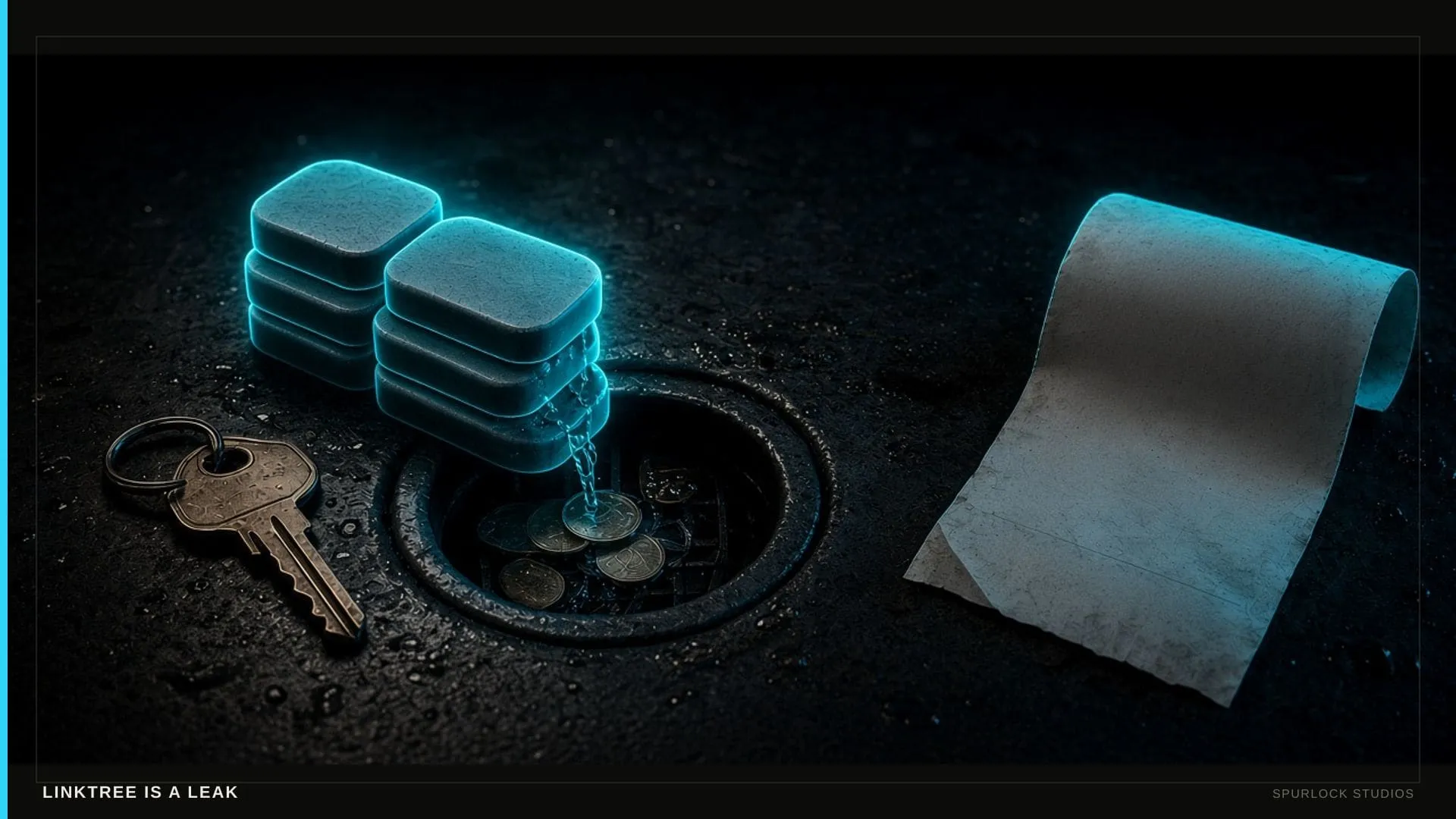
 Linktree is a leak — build the house
Spotify does not send you the fan’s email. Instagram rents the following. Linktree is a hallway with no register. The House is the owned room: site, membership, checkout, follow-up.
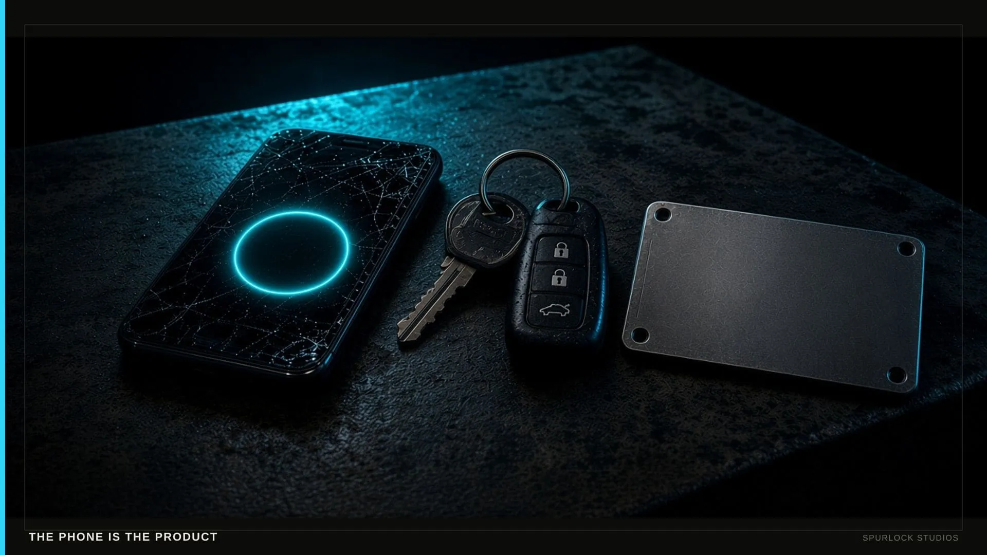 Websites
 The shop site that answers the phone
A Midwest shop does not lose the job to a prettier hero. It loses the job to whoever looks real and picks up. Here is what the site has to do on a Saturday.
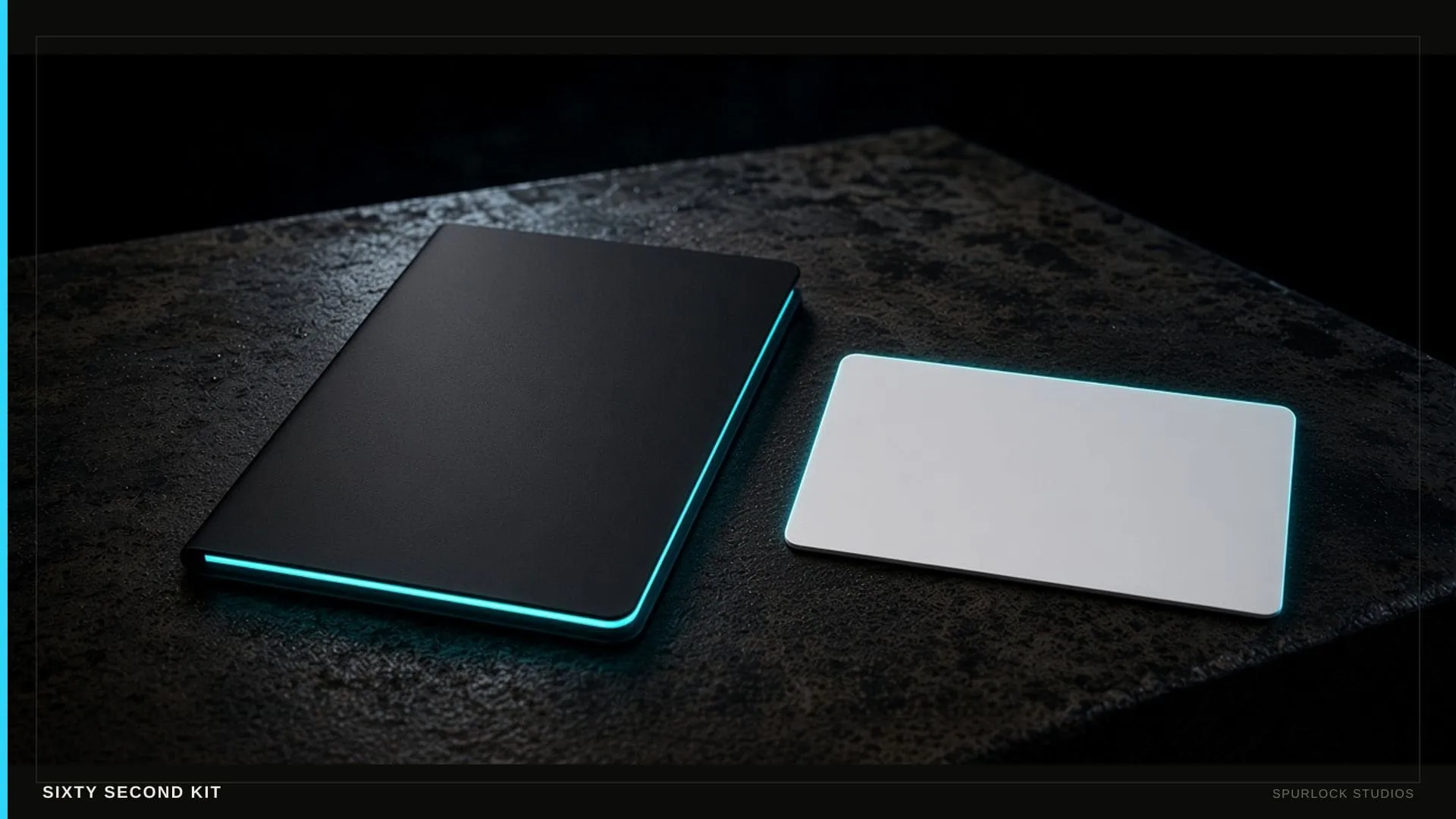 Websites
 A media kit the brand can steal in sixty seconds
Influencers need a brand-safe /media or /kit with rates and demographics you can stand behind — not a Google Doc with dead links. This is not a booker EPK.
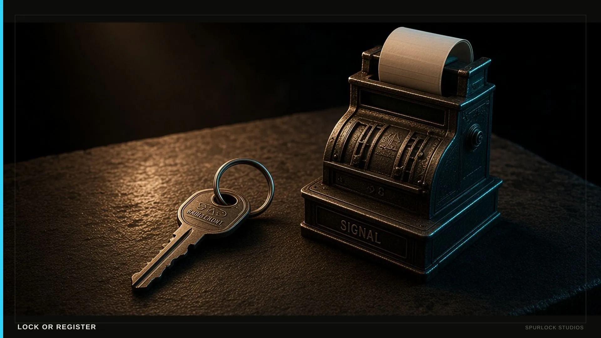 Websites
 Creator Site or Business Site for the house?
Creator Site ($3,500) is tour, listen, join, buy. Business Site ($8,000) is the register. Pick after the $1,500 sprint — not before you have seen the house.